toongco—working
space
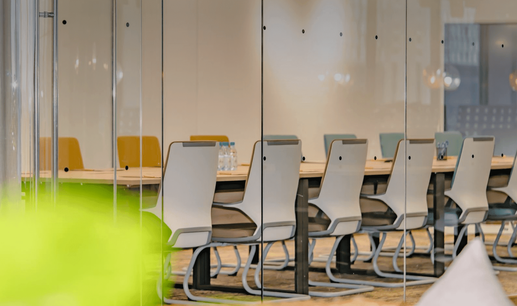
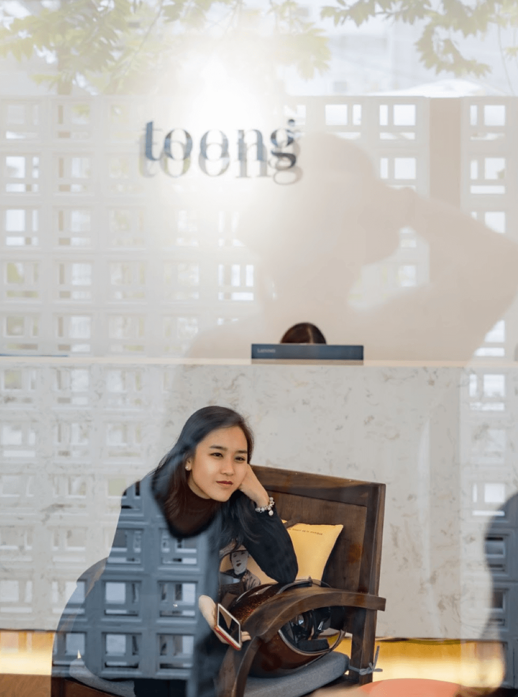
Toong is a chain of co-working spaces started up in Hanoi in 2015. This chain has now expenaded to 14 spaces, located in 5 different cities across South-East Assia. In order for Toong to digitally transfer their key message "creating spaces where conversations nurture new ideas, value turns into change, possibility turns into devlopment", we worked witth thw team to build up the suitable strategy and digital experience system.
- Digital Strategy.
- UI/UX design.
- Interface design.
- Front-end development.
- Back-end developnent.
DURATION12/2019 - 05/2020
Scenario
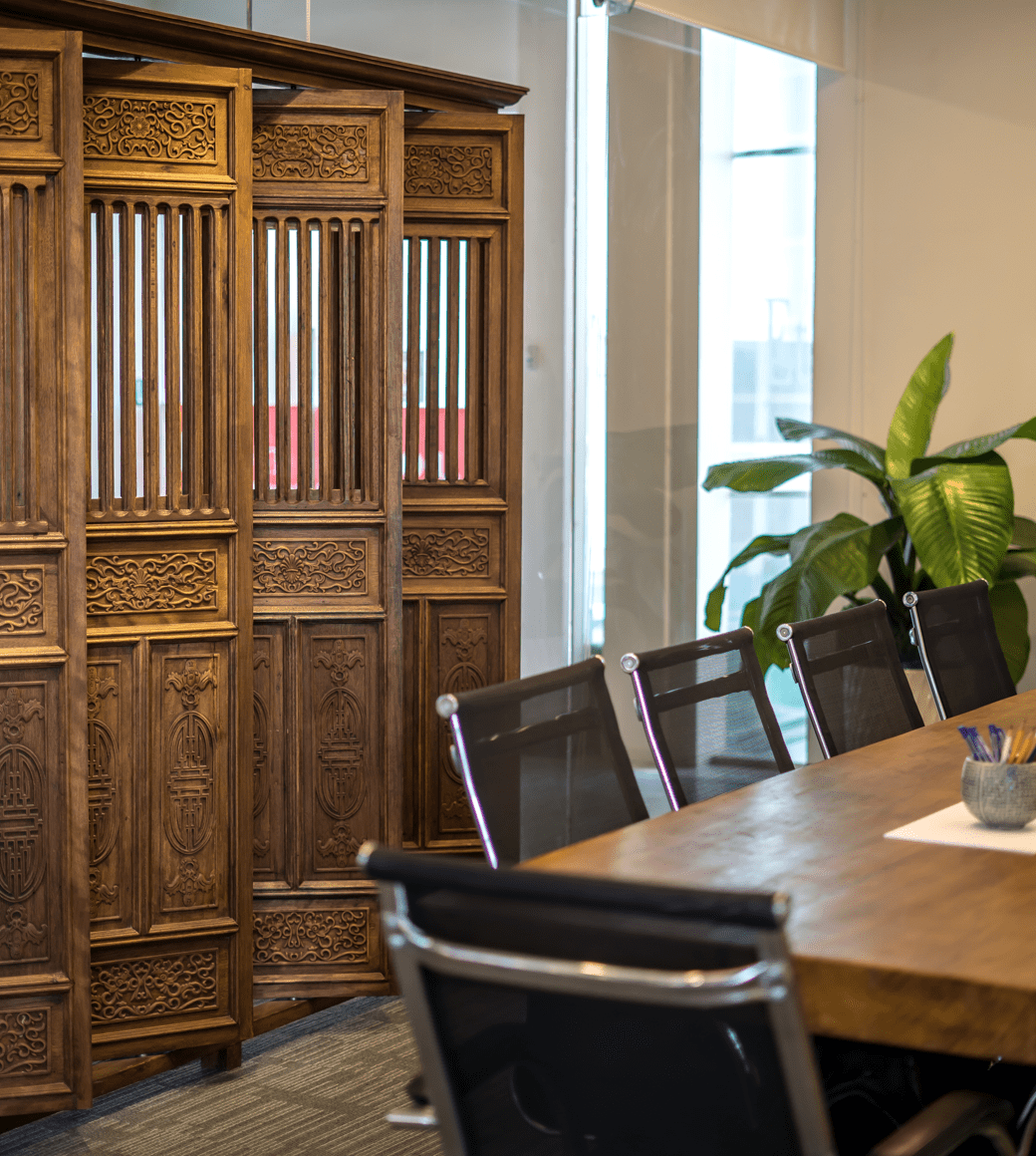
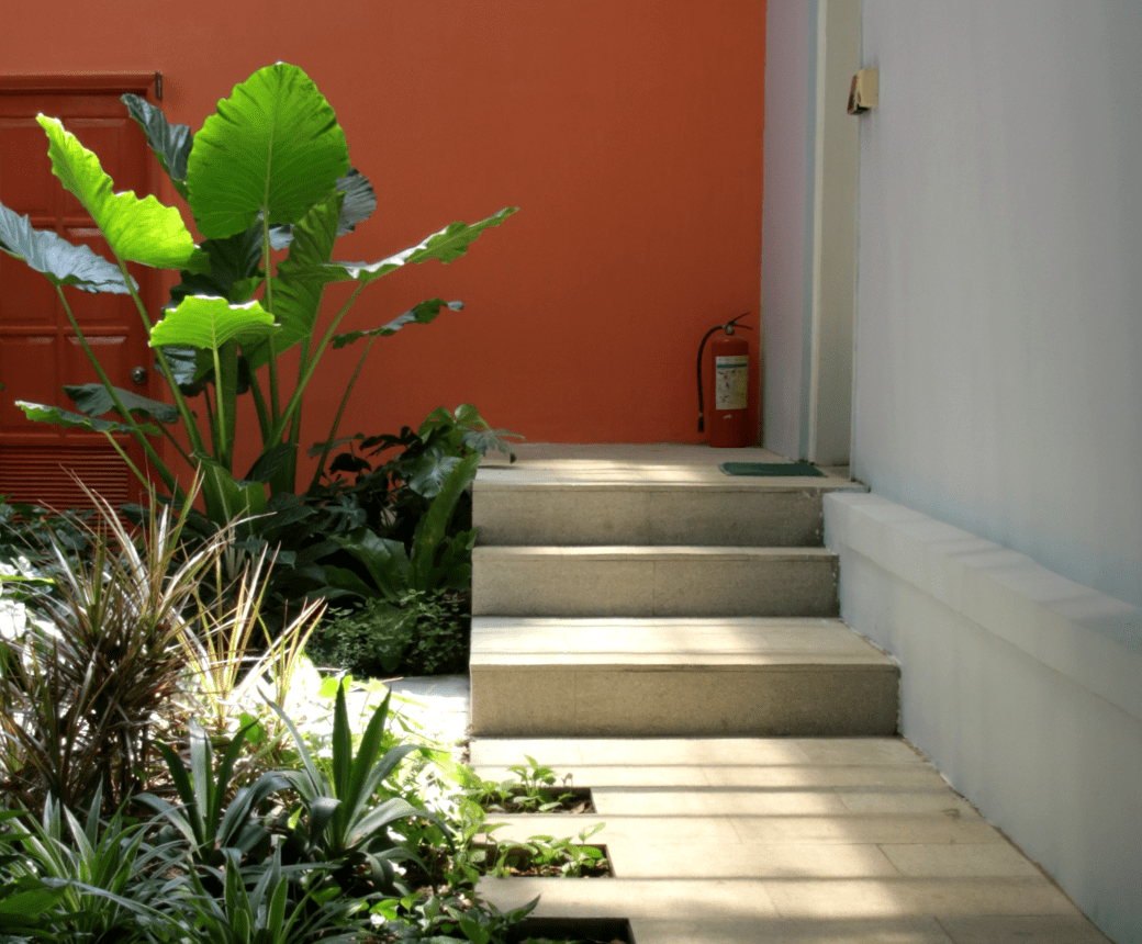
Toong started up in the Old Quaters of Hanoi, The house choosen for the first co-working space was a fusion of South-East Asia style with antique, elegant French architecture, This "Indochine" characteristics was also the brand orientation for Toong in the start-up phase, as it determined the design visual and architectural style. The reason behind this lies in the fact that in the first phase, Toong's target customers were foreign clients working in Vietnam. After 5 years of development, Toong's working space grew out of the "Indochine" style to add more dynamicity and millennials living in big cities as customers in their ecosystem.

It is my persistent belief that there is no boundary or barrier for personal development, except the boundary and barrier that we create ourselves.
Đỗ Sơn Dương, CEO của ToongIn business aspect, other than co-working sapce construction and co-working space for lease, Toong has expanded their business model to 2 more services with their partners as organizations and big businesses. The 2 services include Property Asset Management and Consulting. The current website welcomed a lot of clients, ranging form individual customers to parties and organizations. Despite that, the structure didnt do a good job at navigating and sorting clients.
Work
environment
Built
to Suit
Asset
Management
As a result, the culture-rich image was no longer suitable for Toong's brand visual and digital experience. It even misled their clients and partners from the orginal brand characteristics. Consequently, Toong's digital platform suffered from lơ conversion rate. This problem affeacted the business greatly.
Solution
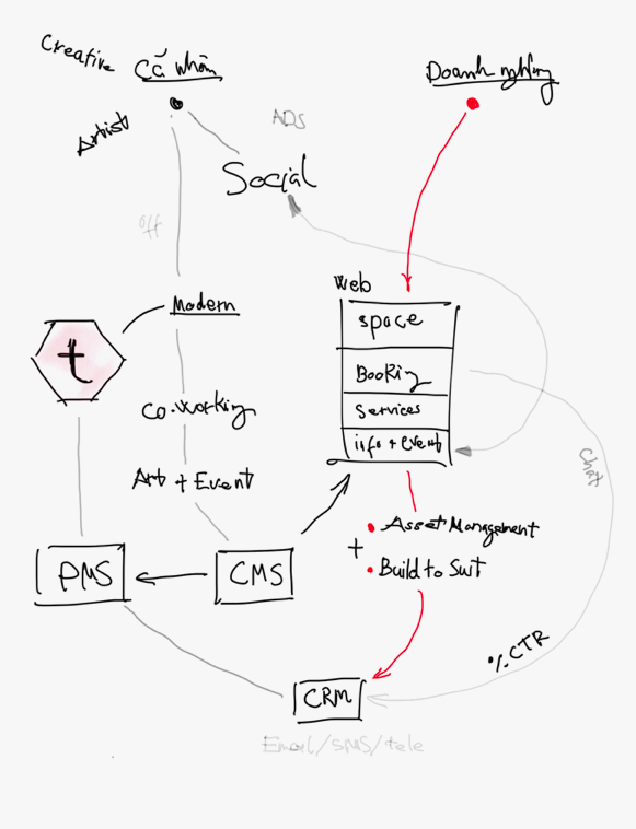
Beau Agency and Toong identified the commen goal for the project, which is to construct a new information structure corresponding to a different target audiences and design a digital experience platform showcasing the most efficient image of Toong's co-working space to users.
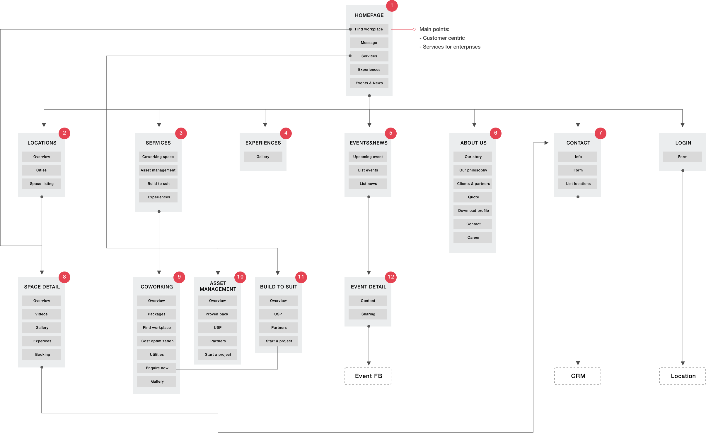
Sitemap
Base on the demand of providing a comprehensive and optimal user expperience, Beau offers a new content structure with seamless and connective, interactive flow while creating an easier access to information about Toong's brand and services.
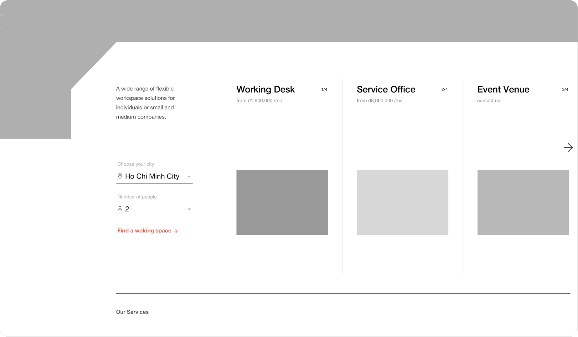
User's demand guidanceThe first section of homepage focuses on solving user's demand on searching for a suitable co-working space through simple and practical filters.
Featured service packagesStimulate user's need to explore by presenting featured packages with reasonable prices - targets individual customer group.
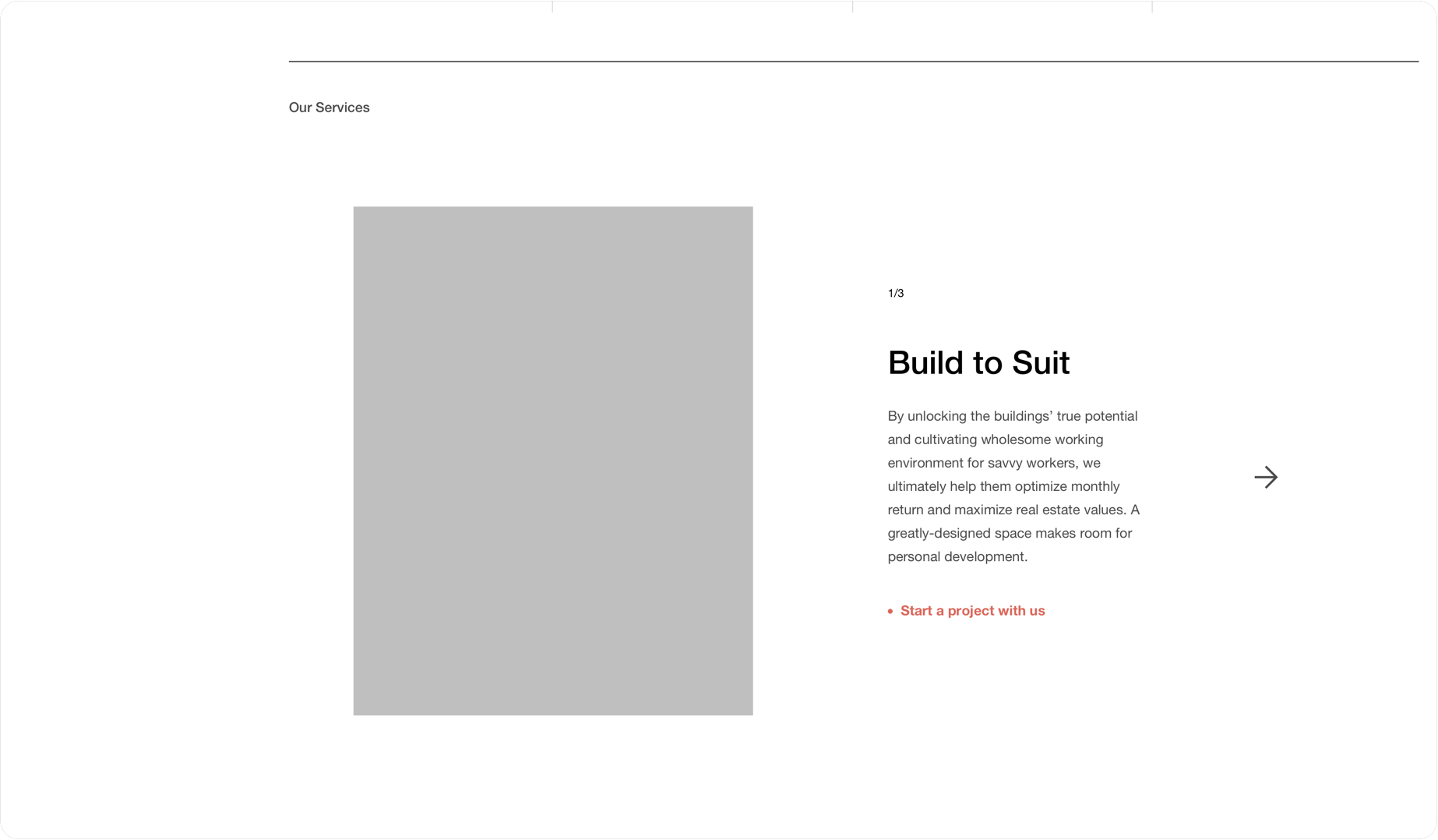
Presenting 3 main servicesThis Services section aims to Corporate Customers, where user can navigate to detail service pages.
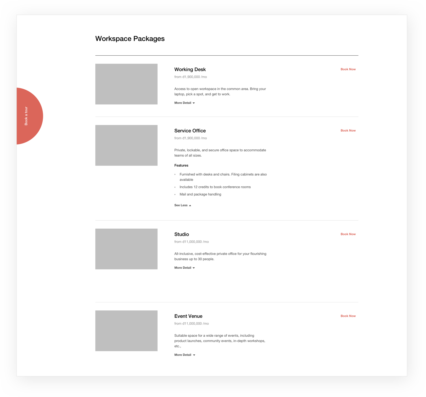
Service packages are presented in a new information layout. User can easily grab the benefits of the packages and book at the moment they find suitable
Toong, bên cạnh vai trò là nơi cung cấp địa điểm làm việc cho cá nhân và doanh nghiệp, còn là nơi xây dựng nên cộng đồng hoạt động văn hoá, đem lại trải nghiệm đa dạng và cơ hội giao lưu cho khách hàng. Cấu trúc thông tin mới giúp thể hiện rõ nét hơn tinh thần này của Toong.
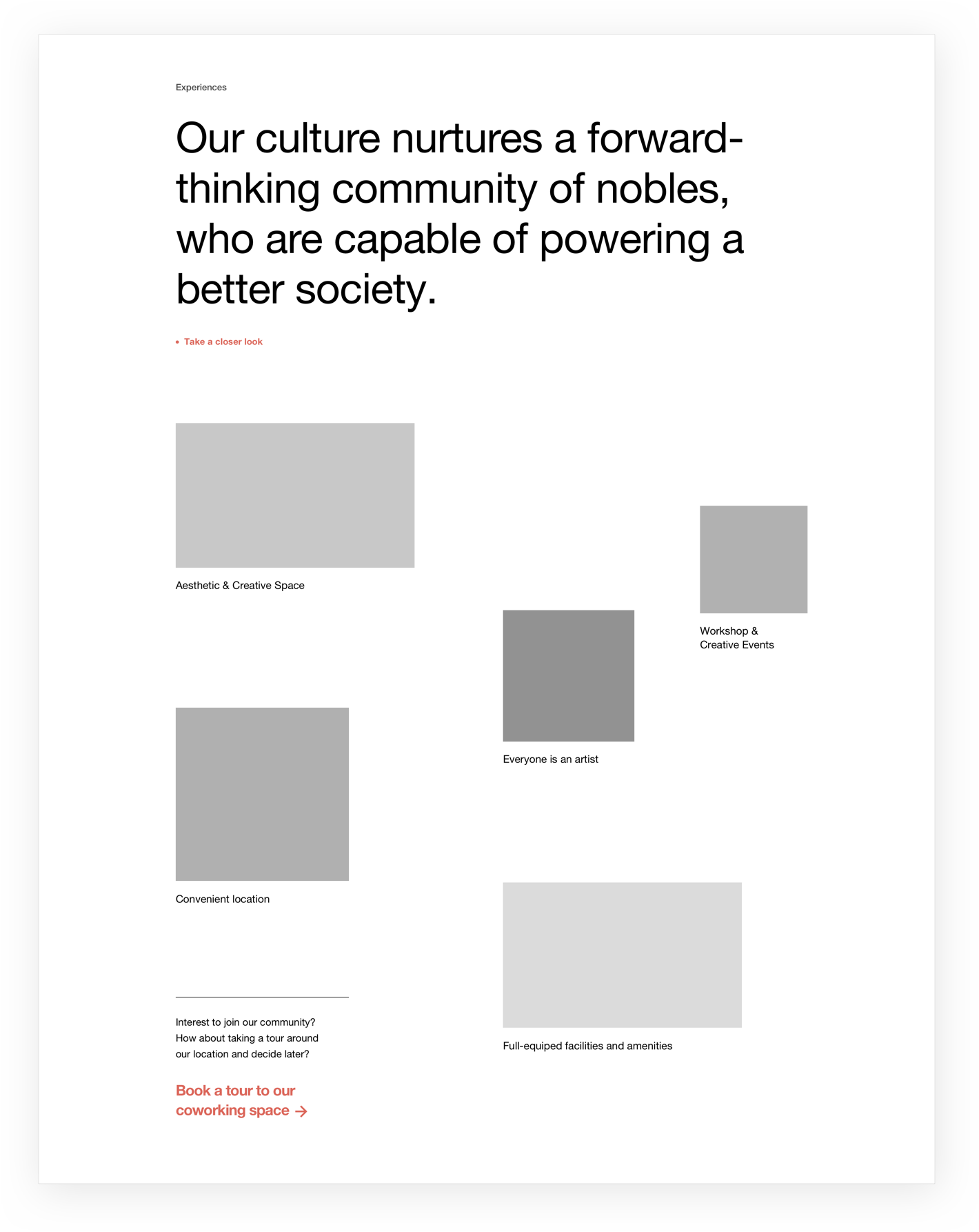
Wireframes
With the new sitemap, we continue to develop full wireframe of all pages which specifies the information flow in the website
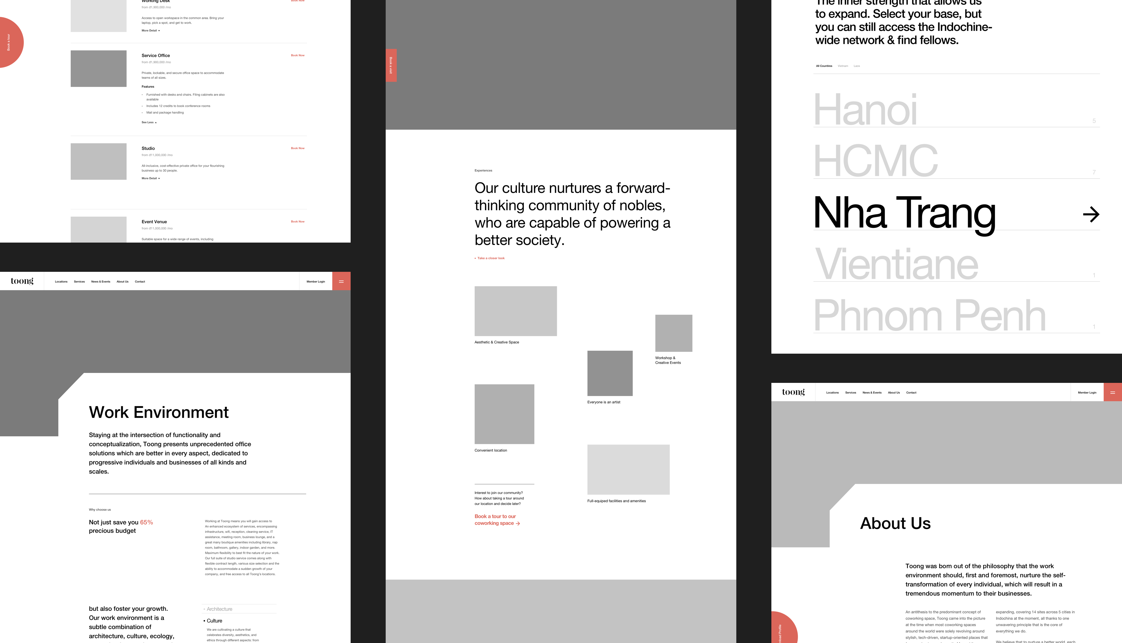
Digitalize your working experience - explore your potentials
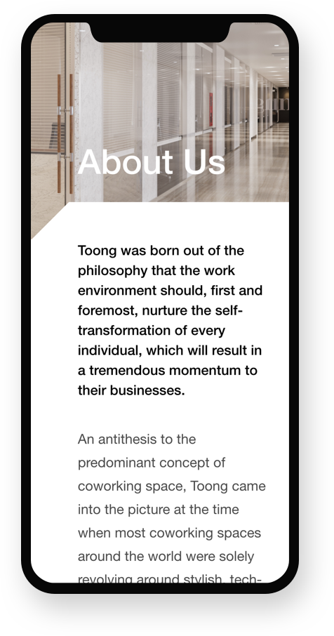
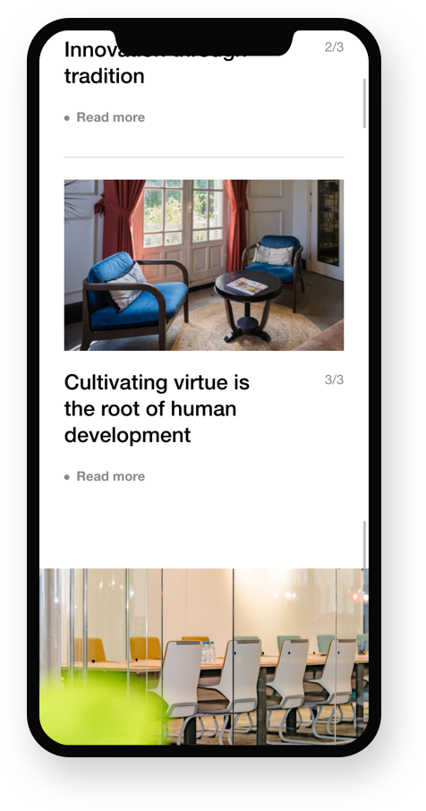
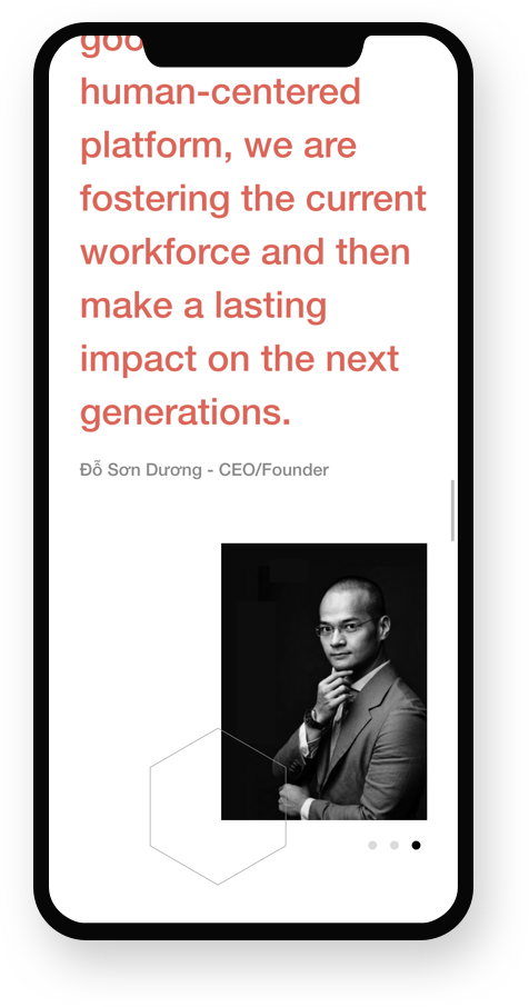
To deliver the working space experience with Bauhaus architectural style onto the digital platform, we executed a solid grid layout with large shapes to create a sense of modernism, full-width images are organized with concise paragraphs.

Execution
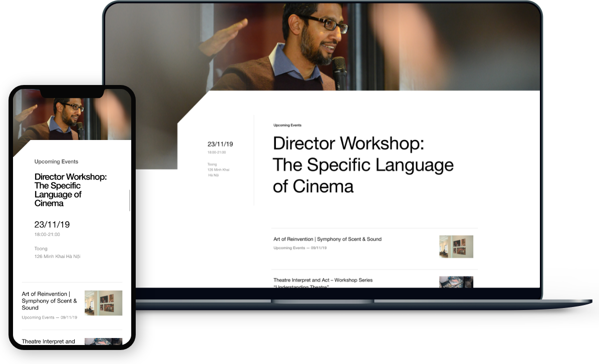
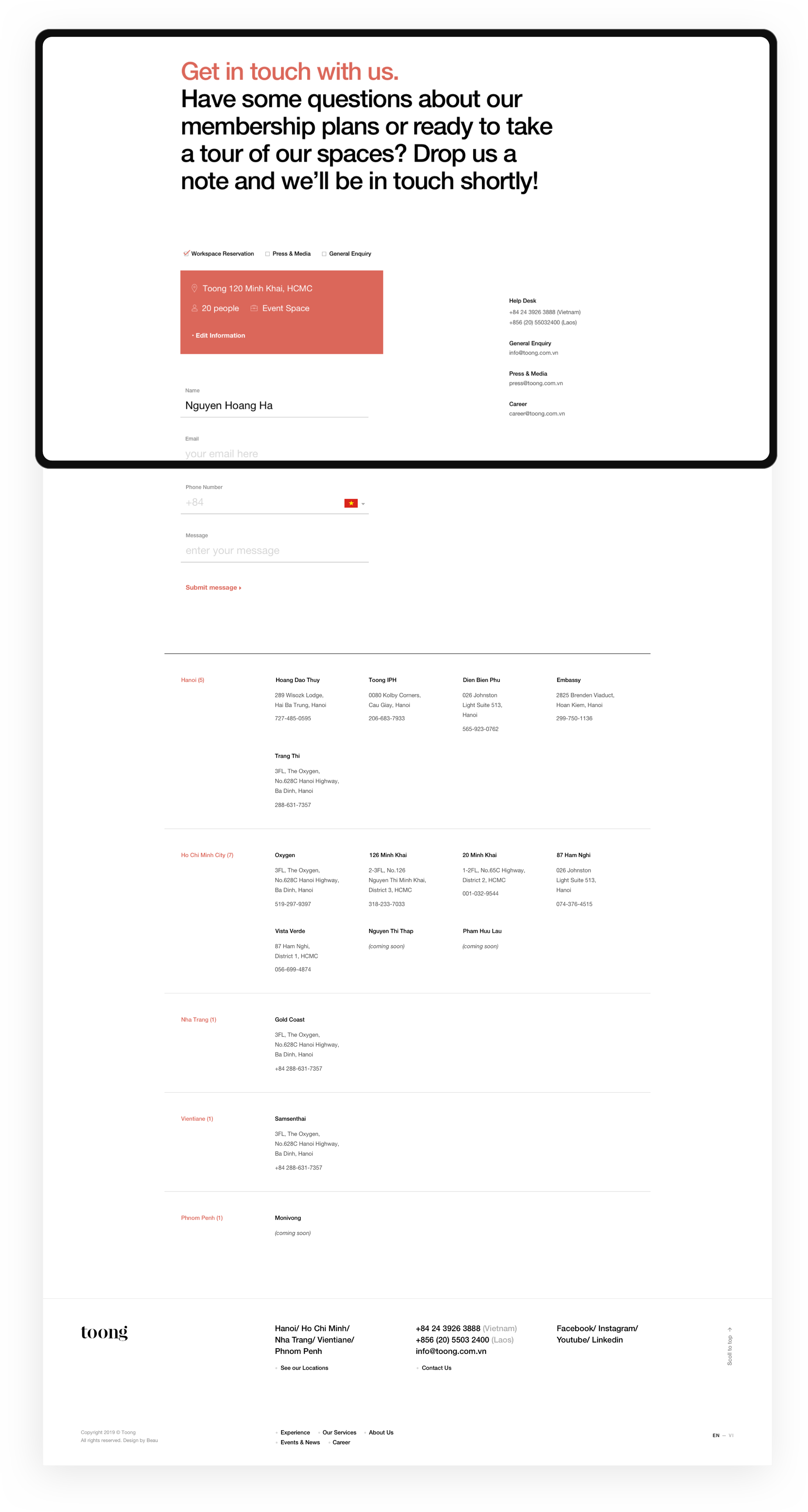
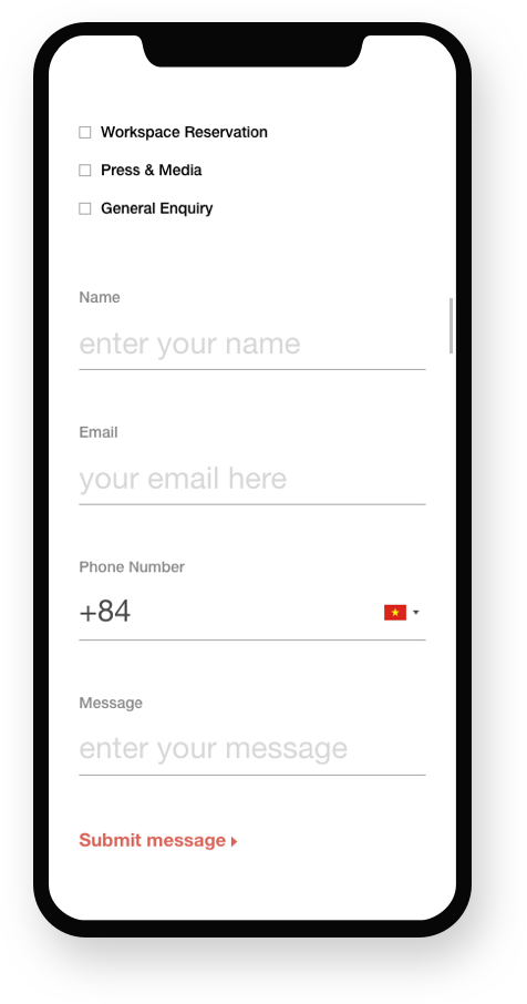
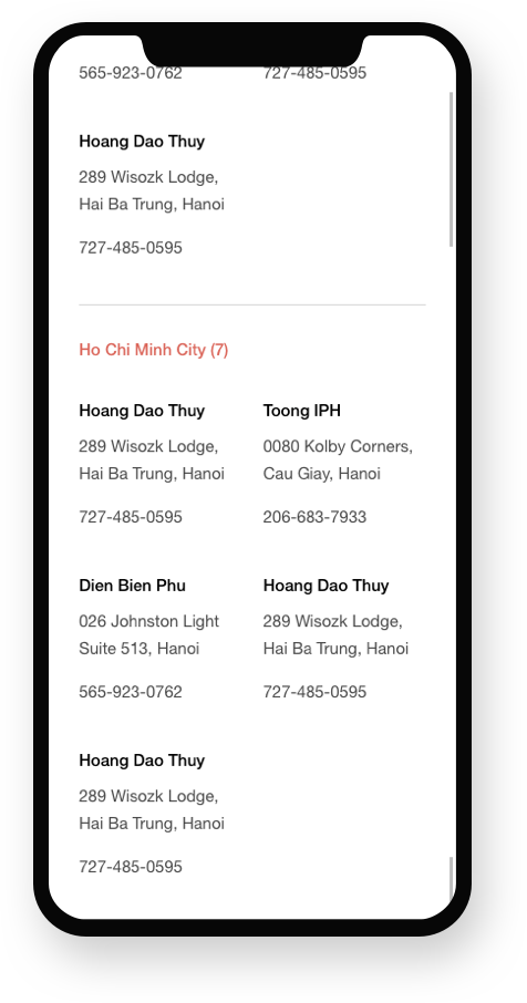
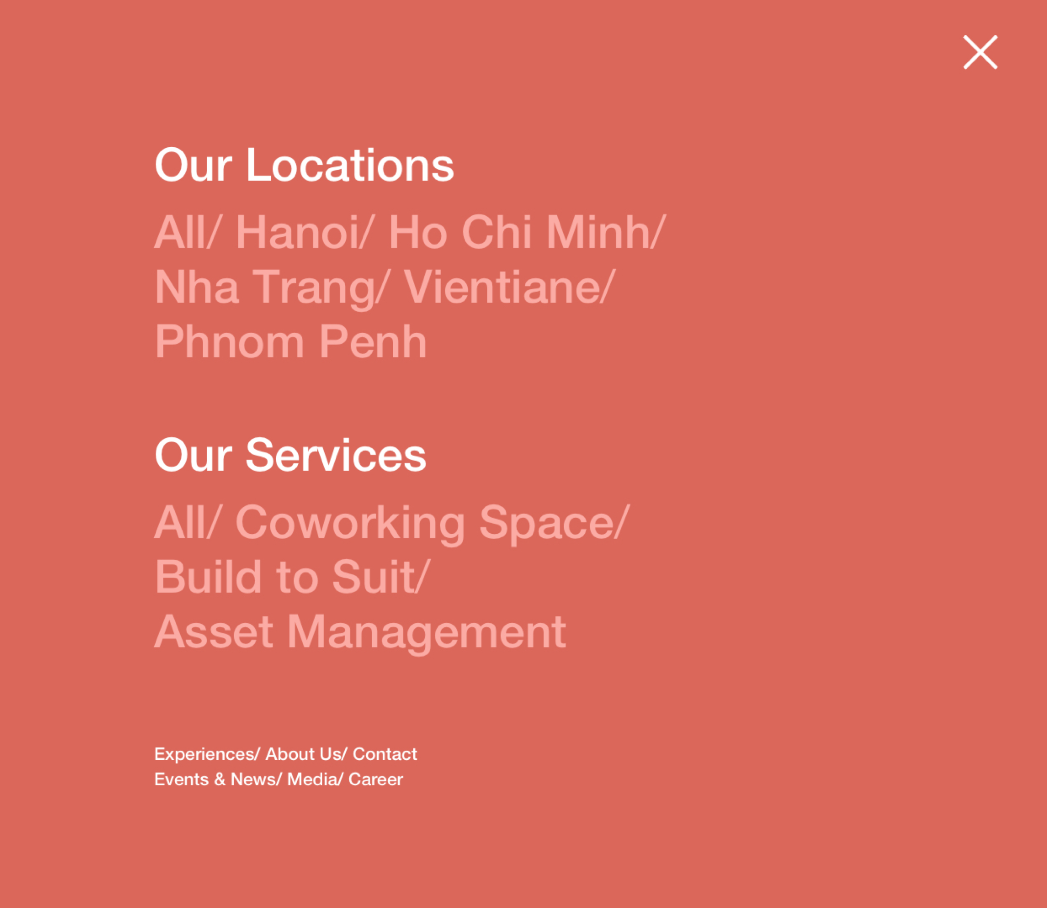
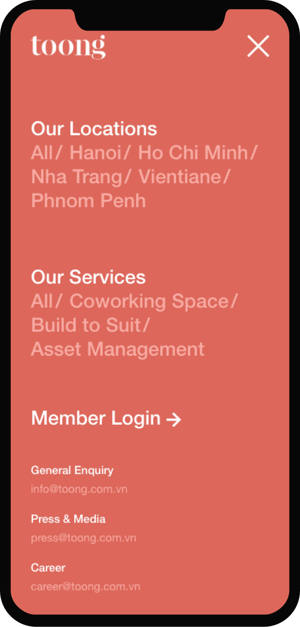
The final result is an exceptional digital experience that transfers a better image of the brand to their customers and solves a series of issues that involves sorting and welcoming the user flow access the website.

Coworking space


Contact
Result
Although Toong's new website has been launched for just a few months, the initial effectiveness of the project has been seen clearly. The project goal, which is to help increase the digital experience for customers, has been achieved. This is reflected through the significant increase of the time on page, the the average website trafific and the conversion rate
average website trafific increased
website conversion rate
website conversion rate
The project result which presents the cooperation between the two Parties also satisfied Toong's management team and human resources.
“The website is a great achievement, thanks to the closely cooperation between Beau and Toong”
