MBBank Digital Experience
Military Commercial Joint Stock Bank is one of the largest financial groups in Vietnam, which is still considered - especially young customers - as an old and rigid financial organization.
Intelligent Banking, Enriching your future
Accompanied with a new brand image, the corporation's digital channel and website have a mission to become the main brand promotion channel to attract and convert customers.
We take on the role of reshaping MB Bank's website, and at the same time develop the design language for this digital channel to not only optimize the user experience but at the same time maximally convey the new brand image in digital space
Multi social media channels of MBBank
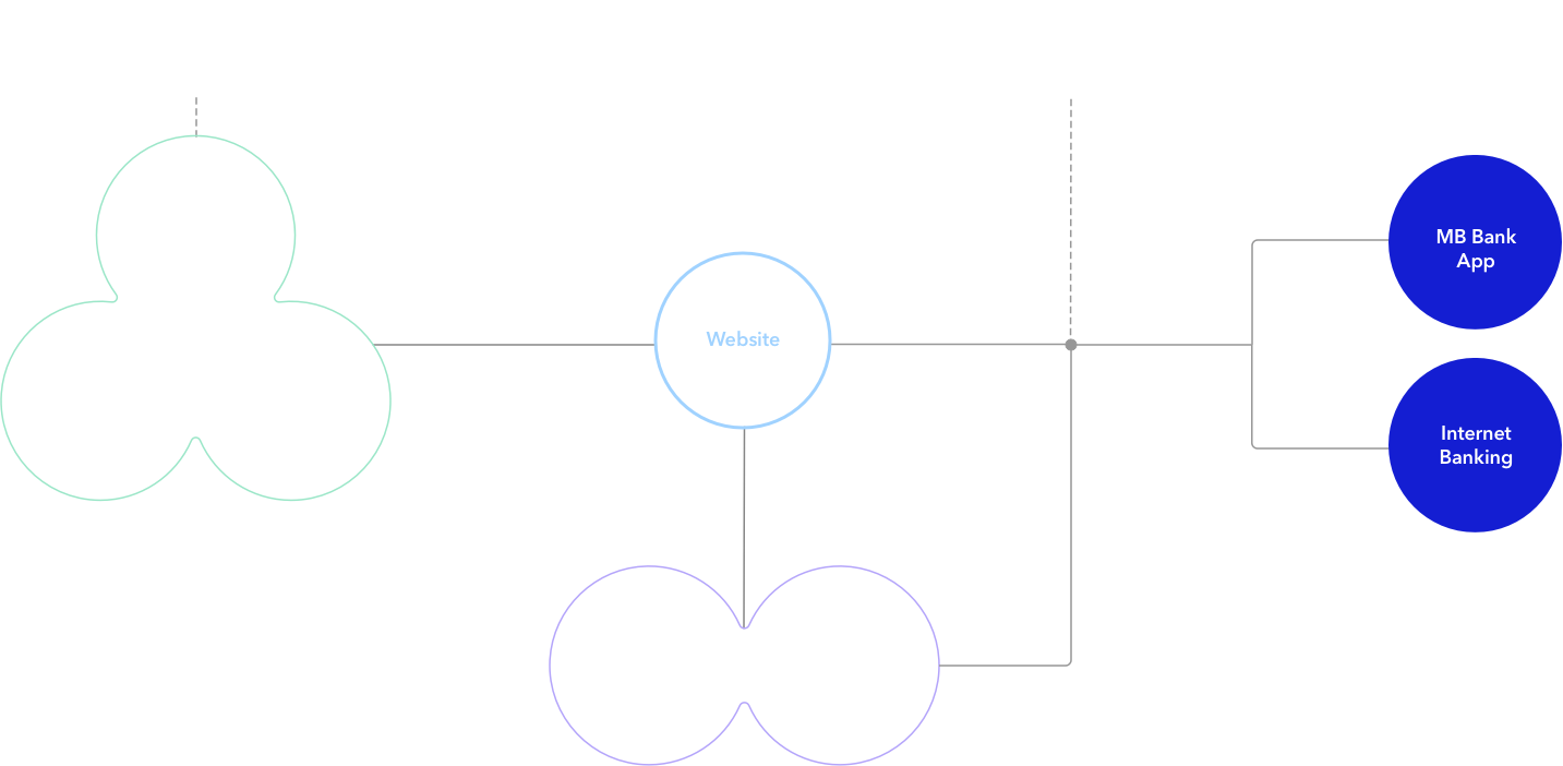
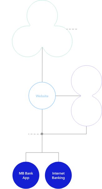
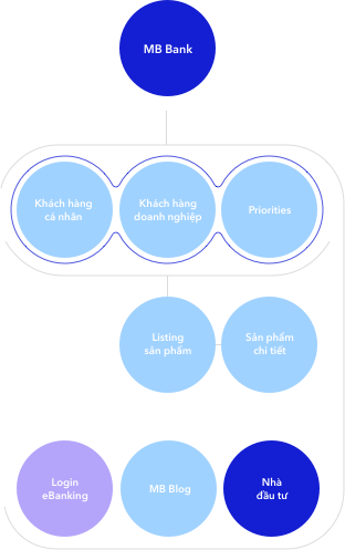
The new website is intended to be a transition and transition channel between all the starting points of the communication touch point system and the endpoints of the digital banking application
Solution
We had the opportunity to work closely with MB Bank's project team, conducting detailed workshops and interviews in order to better understand the new brand orientation as well as the vision that MB Bank set out for digital channels
Brand Characters
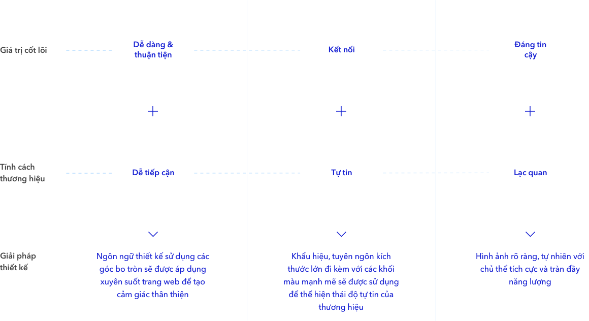
The new brand comes with significant changes in brand tone and personality to bring a youthful and inspiring image to an established financial institution like MB Bank.
Confident
Approachable
Optimistic
- Professional
- Dynamic
- Intelligent
- Connected
- Established
- Innovative
Design Direction
Design direction conveys core values along with brand personality through visual design language.
Home page
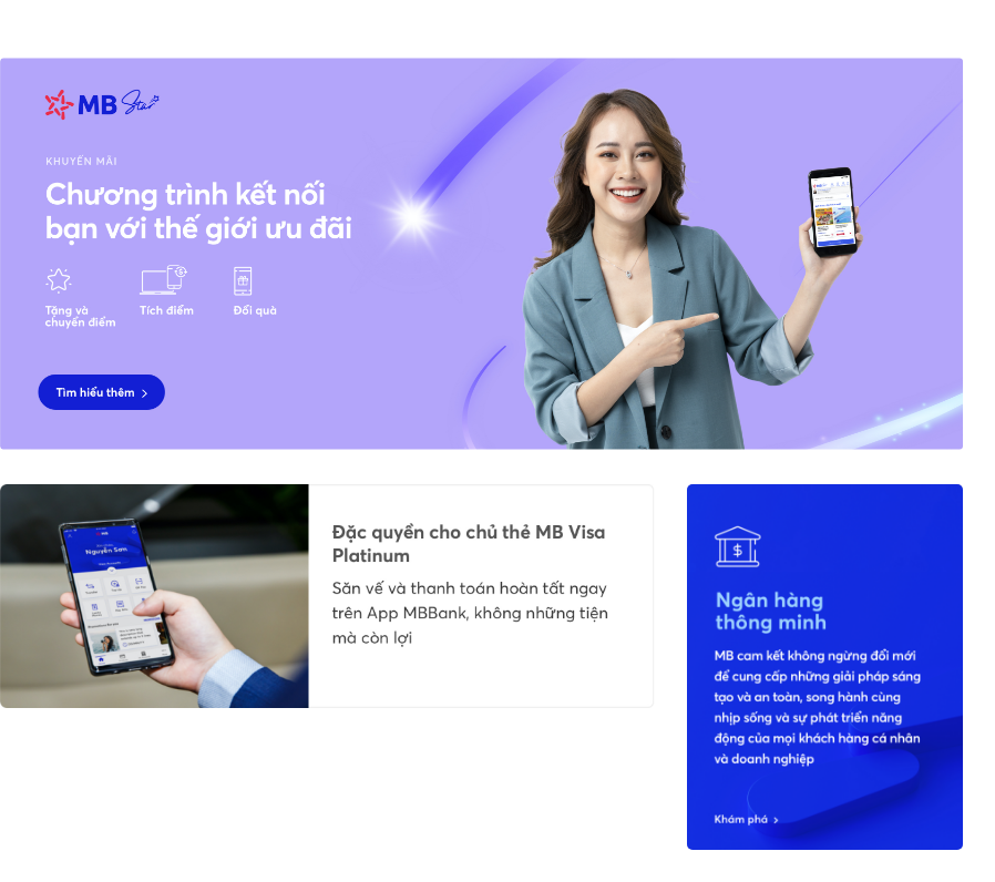
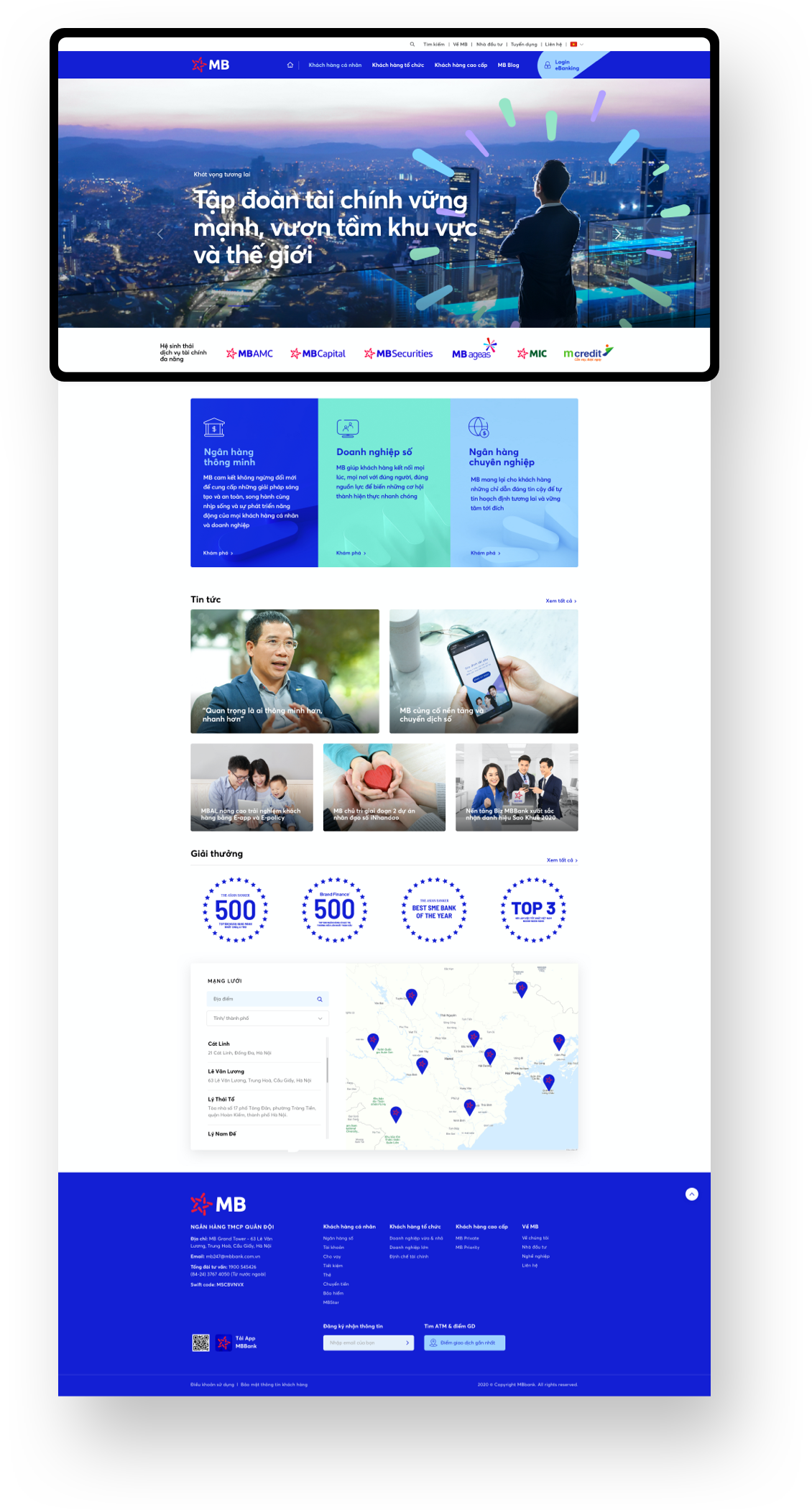
With the goal of introducing a new vision and story of the brand to customers, we have defined two main purposes for homepage. Firstly, Homepage must show the inspirational attitude of the brand to attract customers, and at the same time provide an overview of MB Bank. Both goals are equally important
01
02
03-04
Brand Introduction
Other pages such as About and Highlights are also designed attractively while keeping the consistency of the common design language for MB Bank
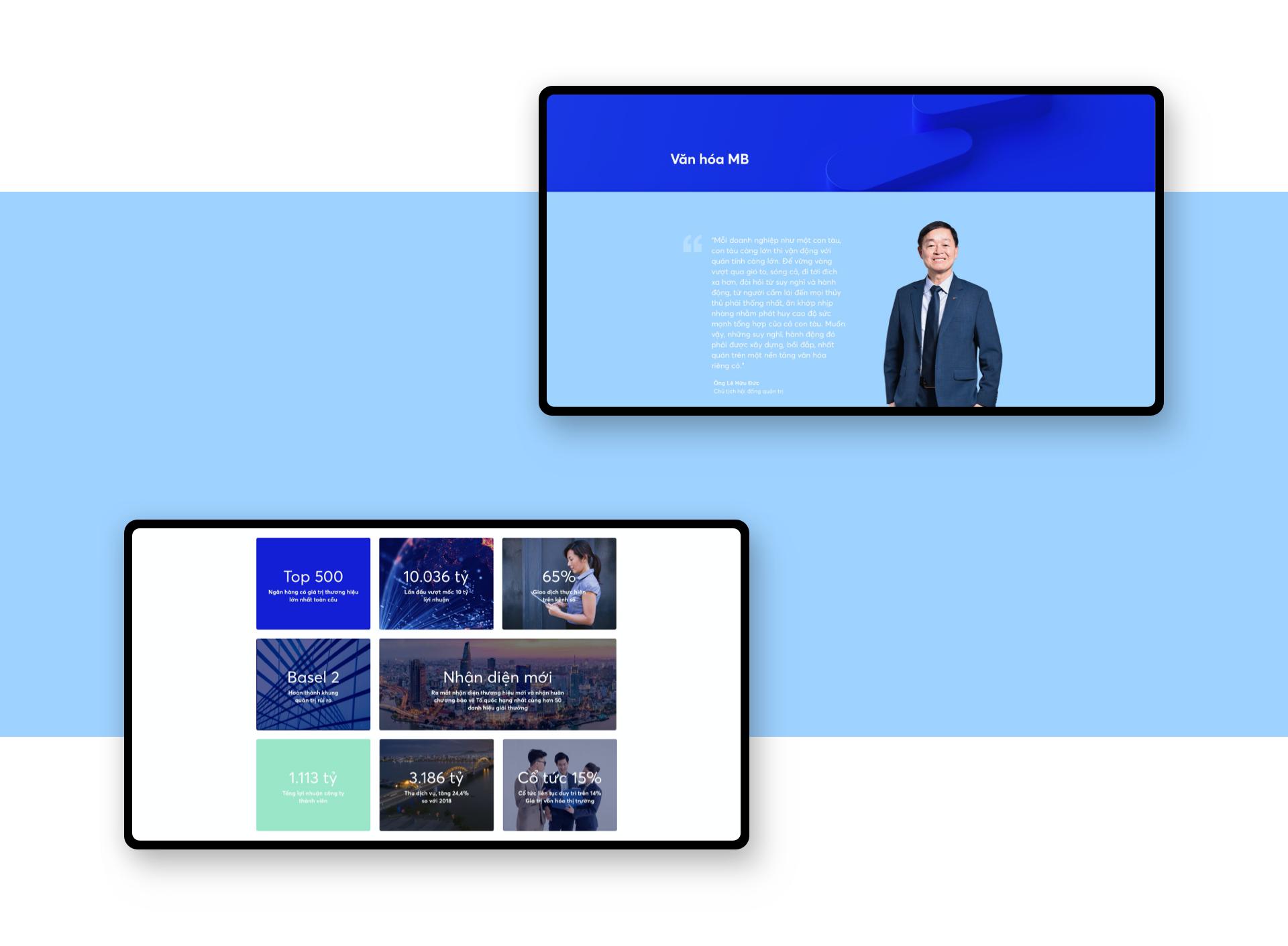
Photo direction
With the goal of bringing a more realistic and vivid image of the brand, the photo direction emphasizes warmer, more natural tones. The image will focus on depicting the interactions among people, while highlighting the subject's optimistic and confident attitude
Customer segment
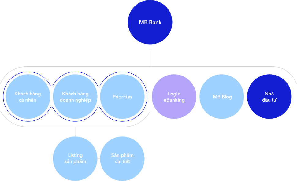
3 main customer segments: Personal customers, Corporate customers and Priority customers, are clearly divided and navigated to 3 respective landing pages which are meticulously designed. Each landing page is customized and personalized to fit the needs of its respective audience
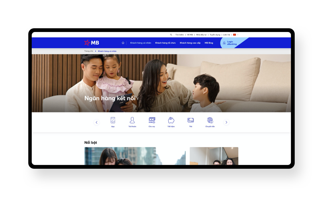
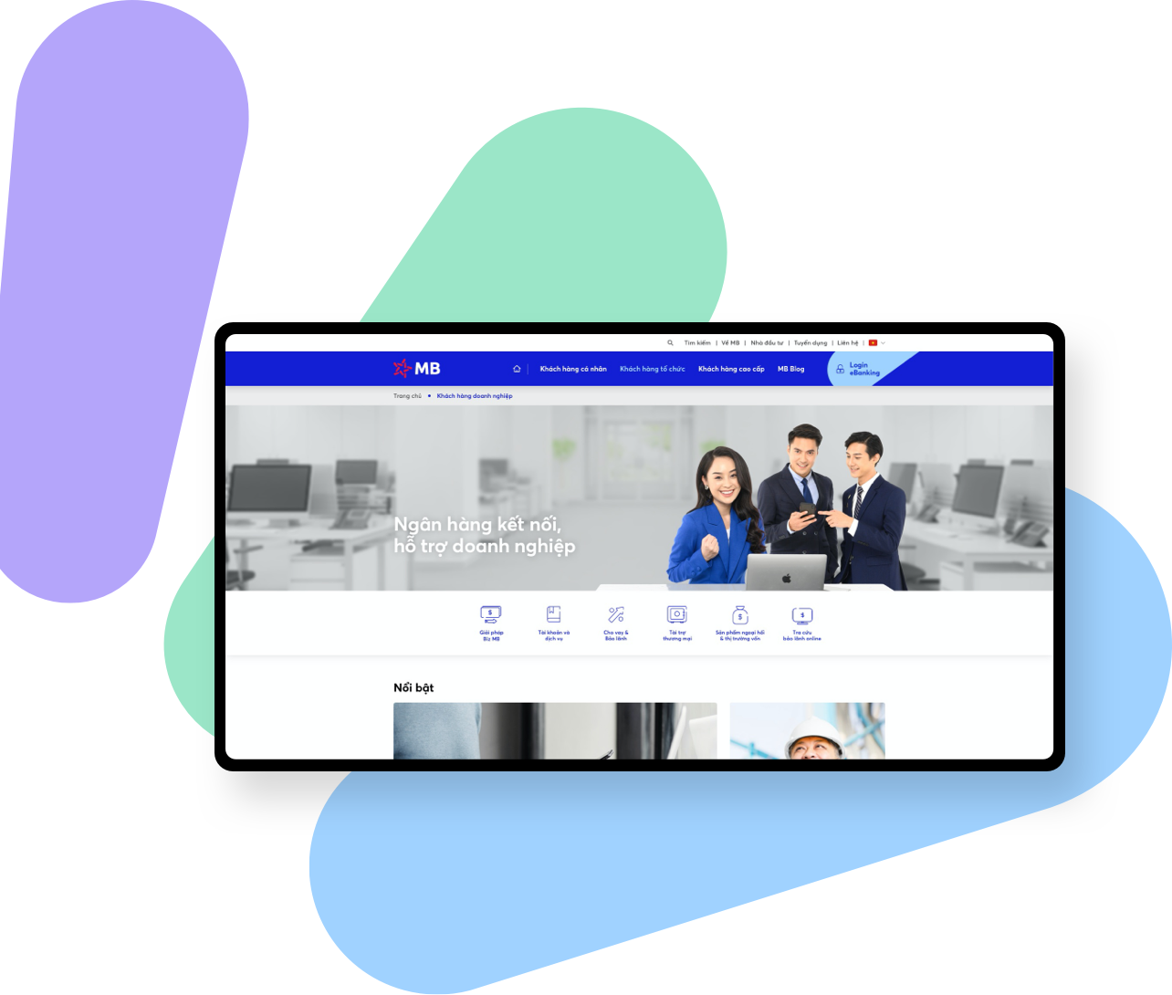
Personal customers
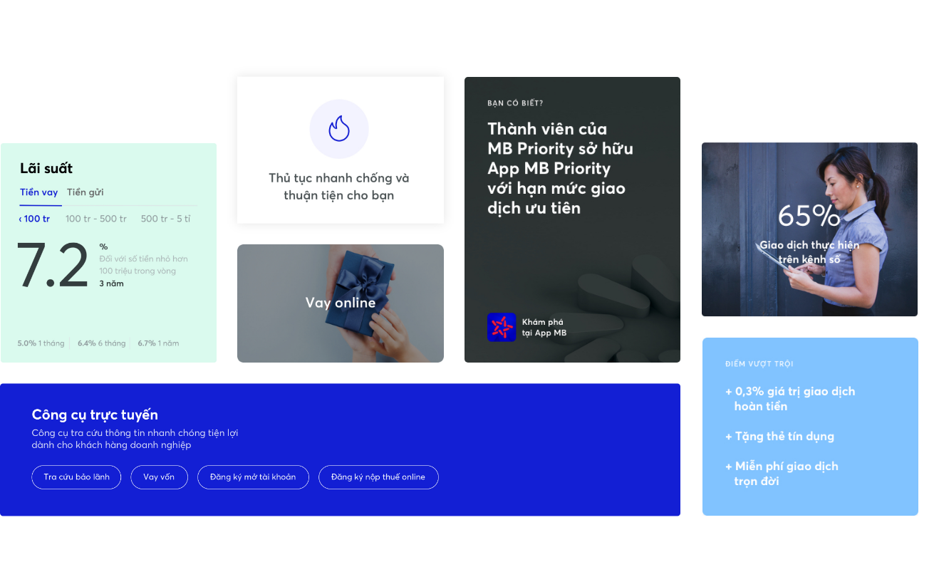
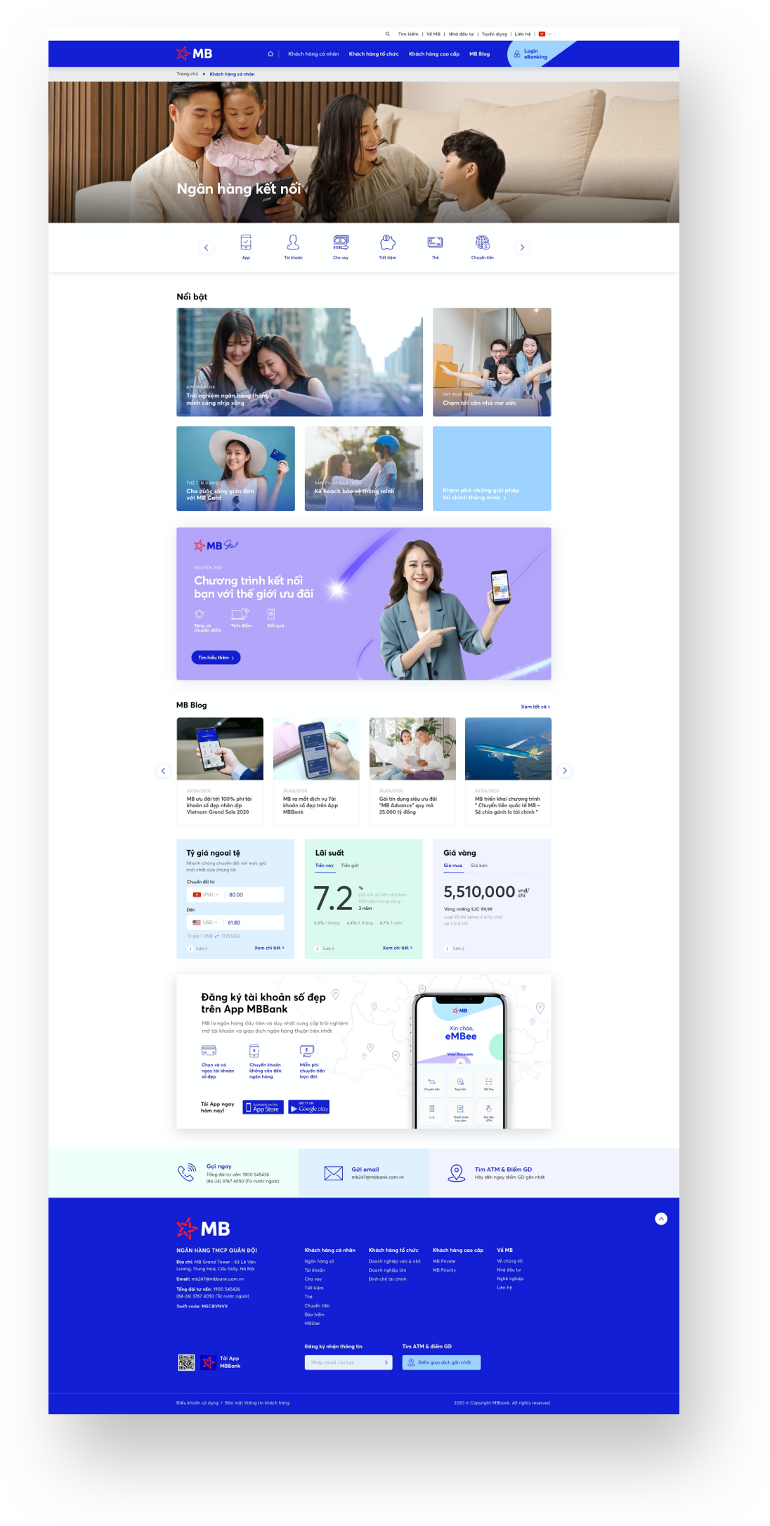
The mini homepage is designed with a customer-centric navigation system. Customers can easily find products that correspond to their own financial needs based on a clear, specific navigation system
Product segments are presented more emotionally and interactively
With the ultimate goal of converting customers into mobile banking app users, exclusive features and offers exclusive for app users are promoted
Quick access tools such as "Currency converter" or "interest calculator" are added to increase the convenience of customers' financial management
Call to action is added to the bottom of the page again, reminding customers of the mobile banking app's convenience
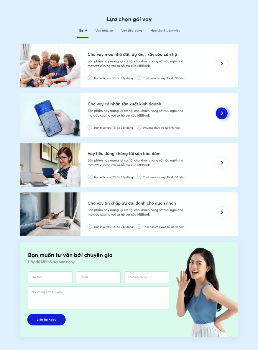
Improve product listing page
Product filters are added to improve the customer experience and help them quickly find the right solution for their financial needs.
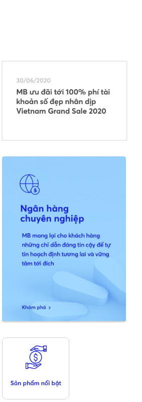
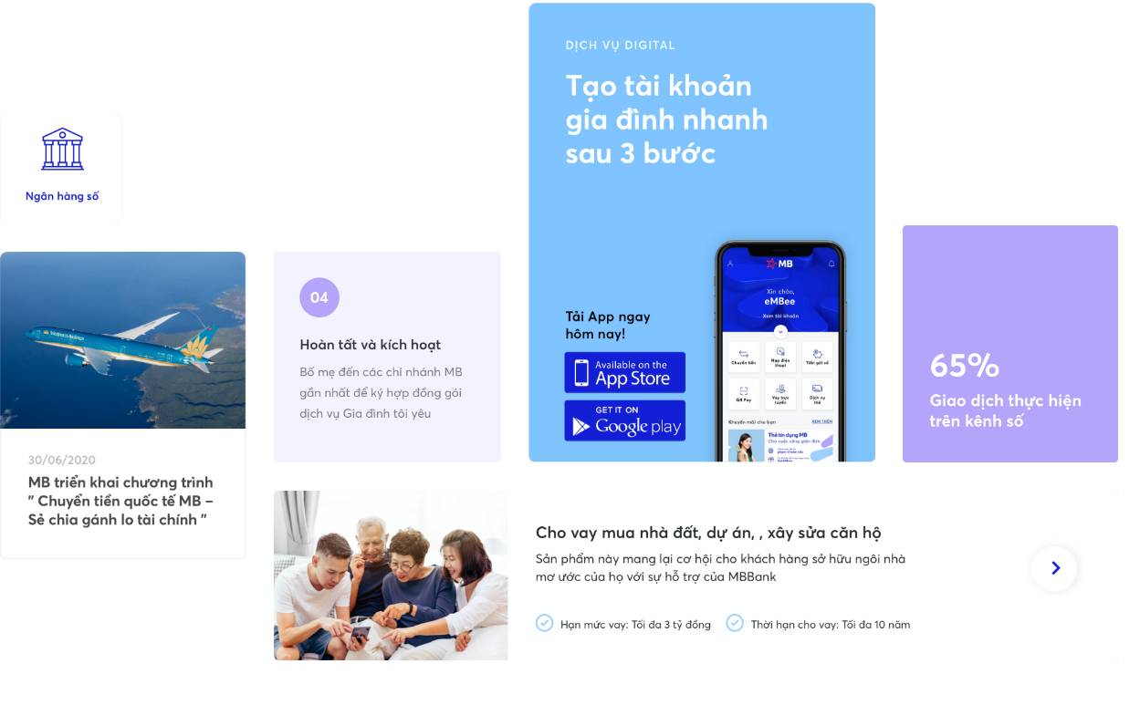
Each individual product card's design has also been improved to not only announce the content of the product, but also briefly introduce the unique features of the product, to capture the attention of customers while keeping the brand image consistent across the entire site.

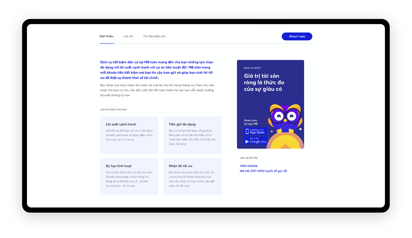
Detailed Product Information
This page provides product detailed information, which helps customers understand product function and product unique features. All registration procedures and required documents that customers need to prepare are also attached here.
Throughout the process of researching and finding the right solution for their financial needs, the client will be faced with a lot of questions. With a simple mouse click, those questions will be solved with convenient and helpful instructions from MB Bank's mobile banking app.
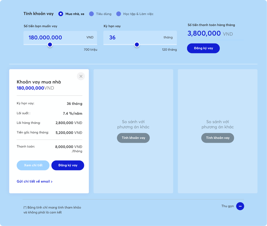
Add-on financial calculator
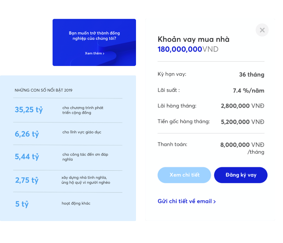
Researches show that customers are demanding more personalized and self-engaging experiences. Therefore, interactive loan calculators are added to the website to help customers easily visualize their financial situation.
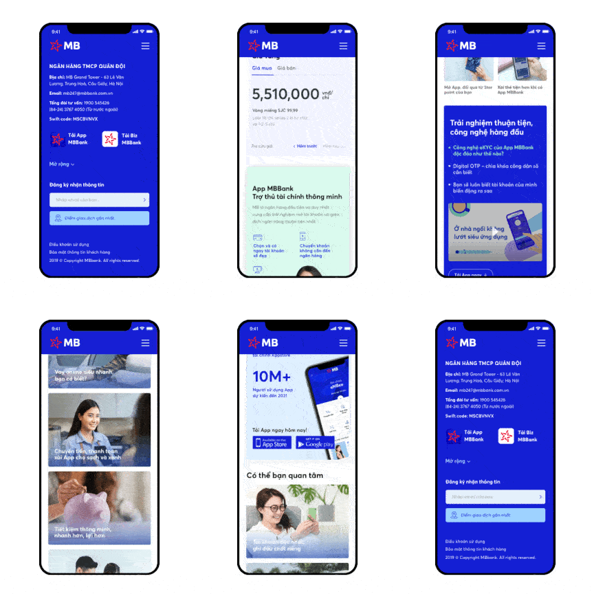
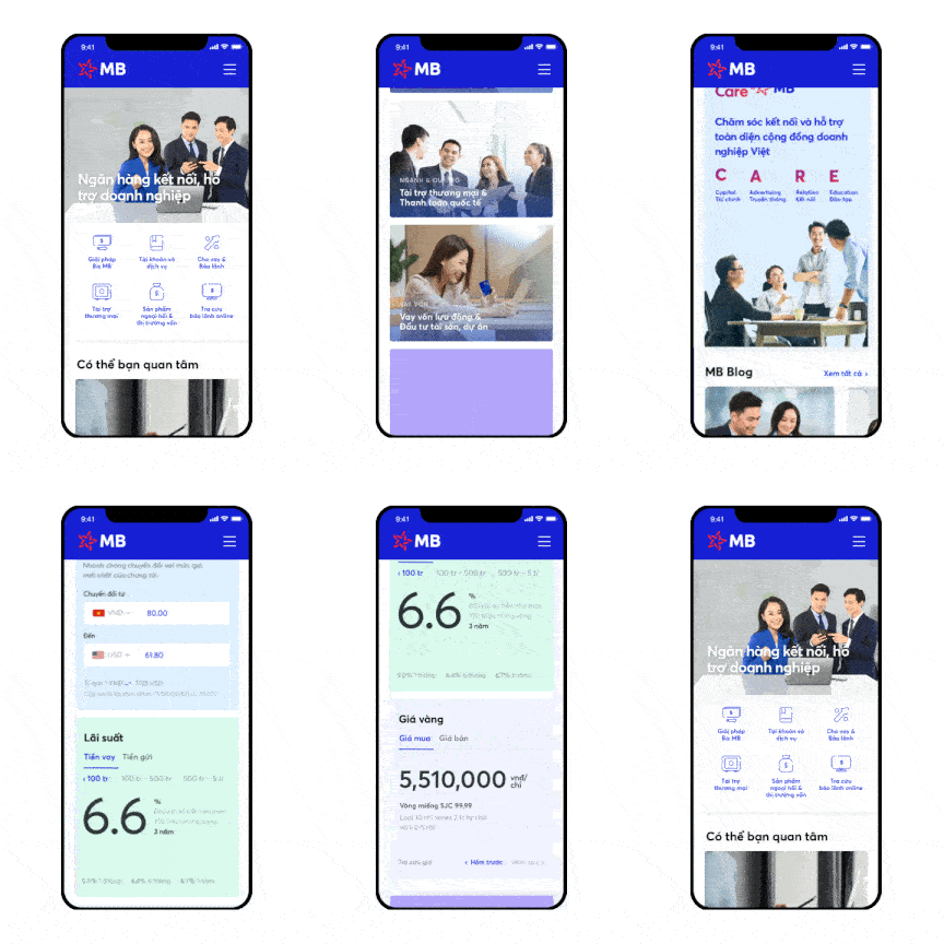
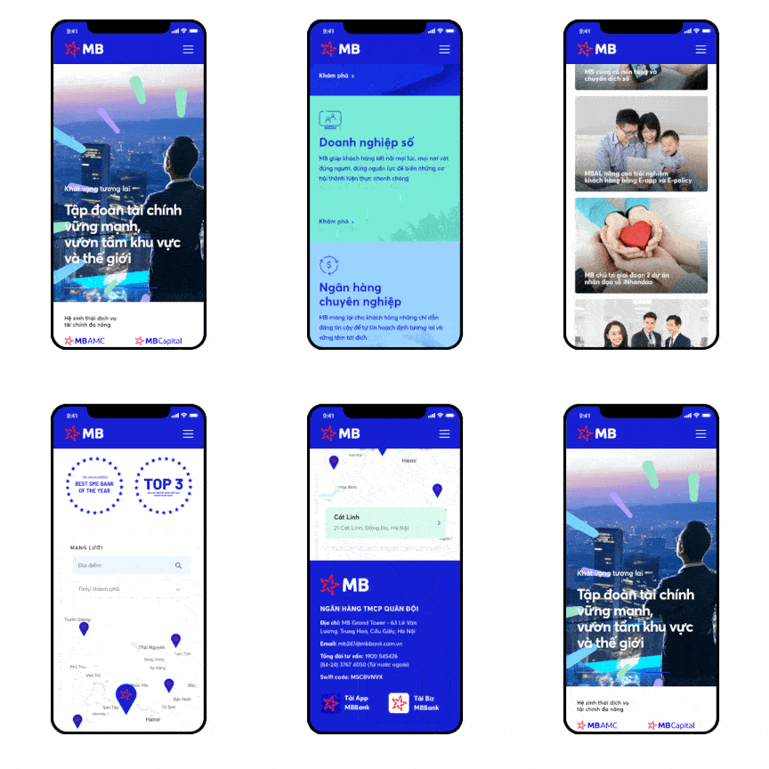
Responsiveness optimized
With logical design, applying a standard grid system, the design interface of MB Bank's website is optimized to perfectly fit all standards and different screen sizes at once without barriers for customers' interaction.
Detailed with sotispication
Meticulous to every detail, all components of the new interface are carefully designed to bring the best digital experience to viewers, contributing to a professional and attractive brand image.
