Swarm Branding and Visual Design
First Some Background
Since 2009, Foursquare has had two core use cases: sharing your location with friends through check-ins and searching for the best venues nearby.
With all of its features, questions about Foursquare usually required long-winded responses:
Usually, people who were interested in the personalized search functionality didn’t want to use Foursquare to check-in or share their location.
We talked to a lot of Foursquare users, and always heard that they either opened the app to search, or to check-in, and rarely both at the same time. That’s why we decided to make a bold move to improve the experience of both use cases.
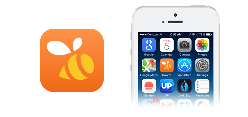
After a series of proposed solutions, we decided it was most natural to separate our two use cases into their own standalone apps. One devoted to sharing your location and the other for personalized local search. This meant moving the check-in functionality out of Foursquare to a second app, Swarm, leaving room in the Foursquare app to focus 100% on local search and discovery.
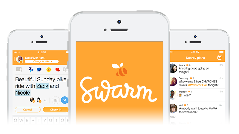
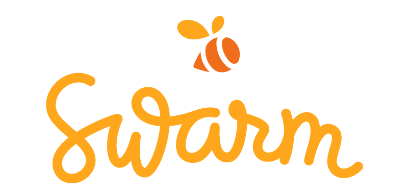
Meet Swarm
Swarm is the fastest and easiest way to keep up and meet up with friends. As an evolution of the original Foursquare check-in experience, Swarm provides an at-a-glance view of all your friends and what they’re up to, making it easier to keep up online and meet up in real life.
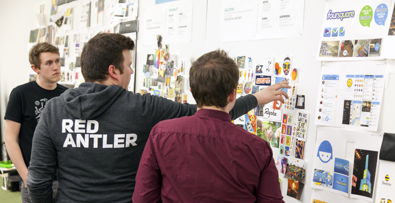
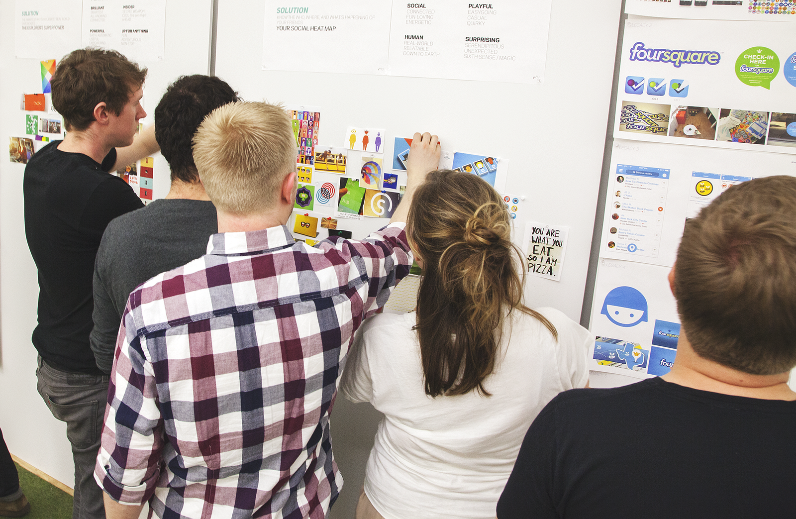
The Branding Process
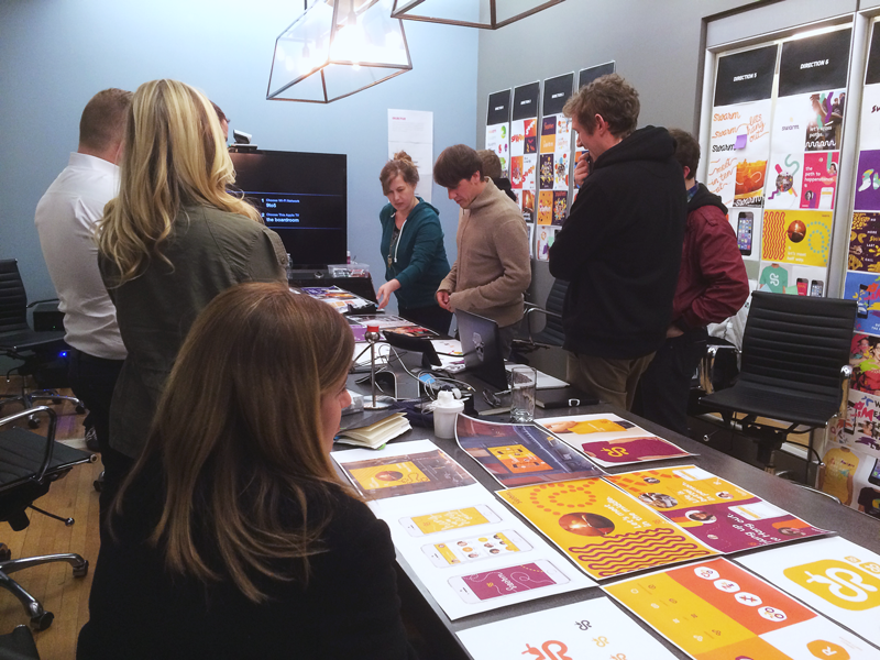
We worked closely with our friends at Red Antler throughout the branding process for both Swarm and Foursquare and I was happy to call their headquarters home for a little over a month while working together.
During the process I had the unique opportunity to work closely with the Swarm team on visual design within the app while simultaneously working with Red Antler on the app’s branding.
Part I: Drawing Inspiration
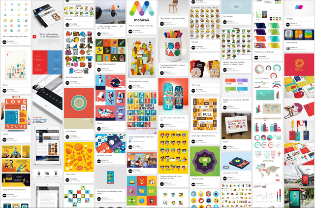
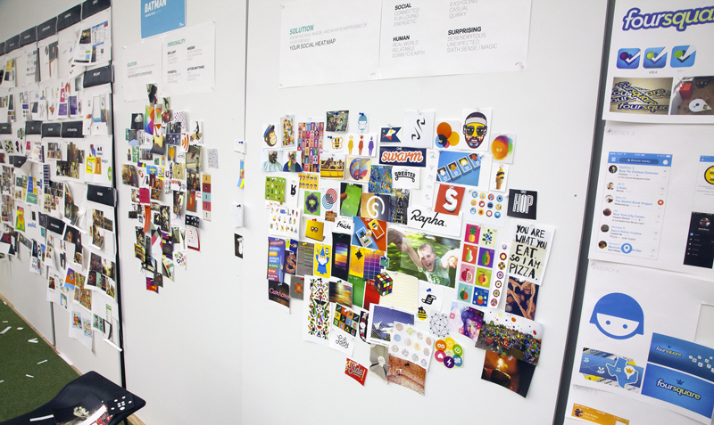
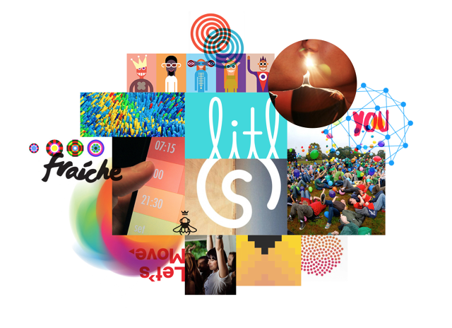
We wanted Swarm to feel fast, playful, and evoke serendipity so we needed an identity that matched this personality. We began the process by digitally collecting references and imagery using Pinterest then physically printing, cutting, and arranging the images into a mood board.
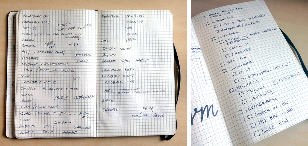
Part II: Ideating and Iterating
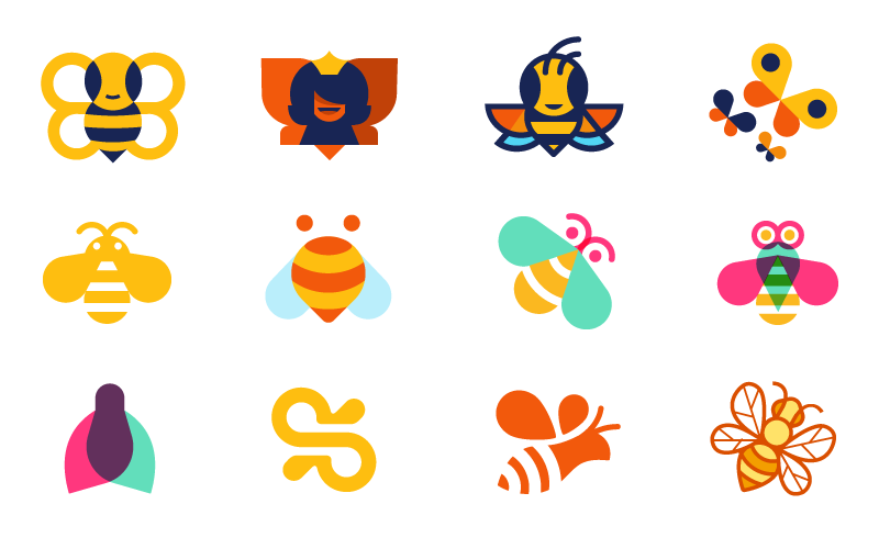
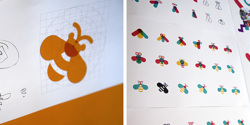
Once we settled on a mood board that visually represented the personality we wanted to embody, we began to sketch out ideas for a logomark.
Our previous Foursquare identity didn’t have an official logomark (though there were many unofficial ones…) so this was something we were very interested in incorporating to both the new Foursquare and Swarm brands.
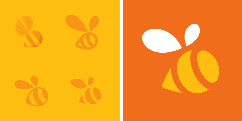
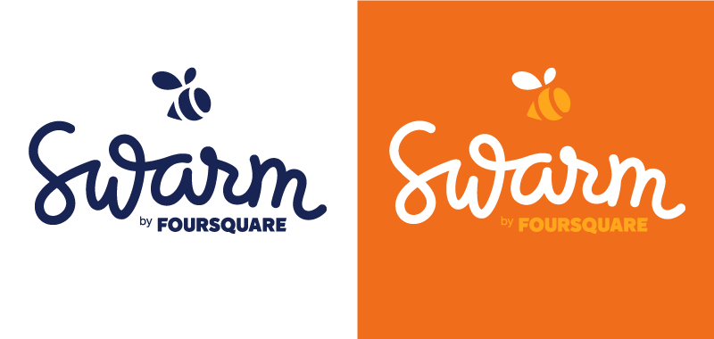
Logomark Development

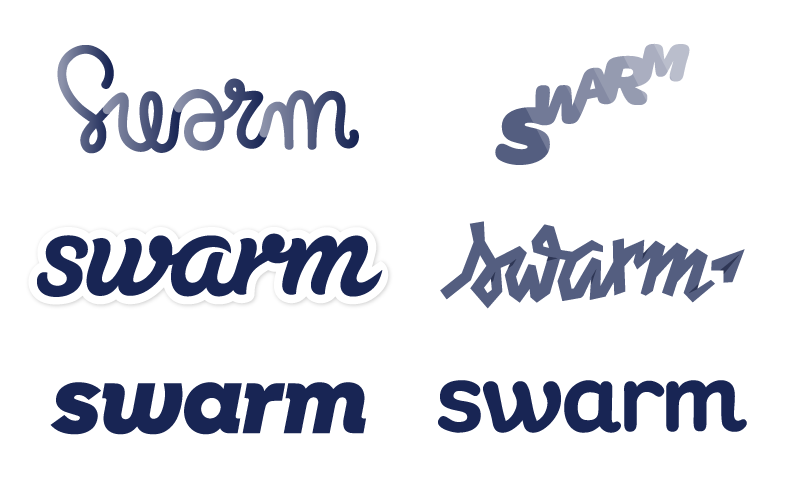
Wordmark Development
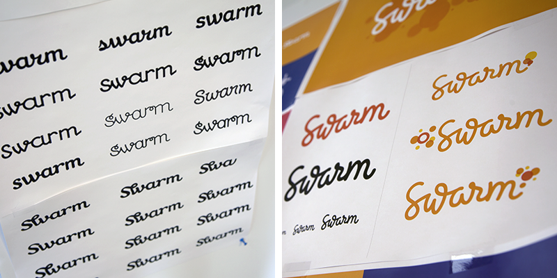
Part III: Finalizing the System

Swarm’s Visual Design
While I worked with Red Antler on branding, Courtney Christopher led the UI design efforts in the app. Eventually we collaborated as we began implementing more visual elements within Swarm. I had a blast developing the overall styling of Swarm’s stickers, iconography, and other visual design.

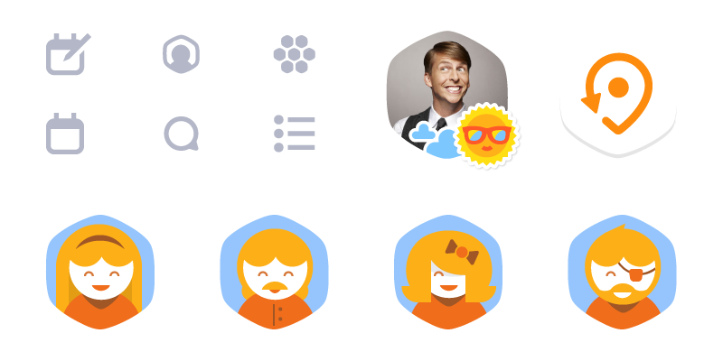
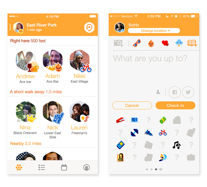
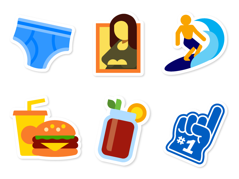
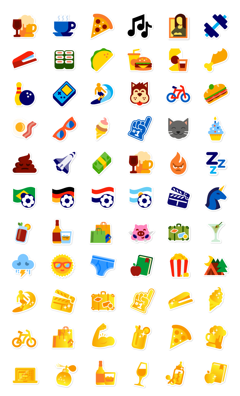
Stickers
When we built Foursquare back in 2009, game mechanics were added to help users learn how to use Foursquare and help make real-world experiences more fun. Users were awarded badges and points for exploring new places and mayorships for customer loyalty at their favorite spots.
As our user base grew, the gaming elements began falling apart. Mayors were great when Foursquare was small but as our community grew, earning a mayor crown became nearly impossible. Badges were fun to collect but many of our longterm users had stopped unlocking badges long ago, leaving no more added incentive to check in.
So, with Swarm we decided to give our gamification elements a much needed refresh. Now, people can unlock stickers to apply to their check-ins to quickly express how they feel or what they’re up to. Rather than competing with the rest of the world, Swarm mayorships are earned by beating out your friends in a particular venue category. If you’ve checked into the gym more than any of your friends, you’re awarded a golden bicep sticker to use to humblebrag any time you’d like.
Being a part of Swarm’s branding and visual development has been an unbelievable opportunity and learning experience. Not only did I witness the incredible amount of work it takes to make an app from scratch, I also got a behind-the-scenes look at Red Antler’s branding process.
For Swarm, the all new visual identity is just the beginning. Follow along as we continue to iterate our game mechanics and other features to make keeping up and meeting up with friends even easier.
Article by Zack Davenport
